As part of the LightHall Product design challenge, we were tasked on designing Maya, a website for pet insurance. As someone who loves pets and believes in making technology work better for us, I'm excited to dive into my approach in building Maya onboarding to not just be like another insurance company; but a pet lover's dream come true.
Our focus was on the Application and getting first time users to sign up and convert without worrying about the hassle along the way

Following some conversations with pet owners on how they got signed up on their insurance we noticed a recurring theme of Vet Doctors recommendation as the prevalent reason for taking on a pet insurance or choosing a specific insurance company.
Theme and Branding
Following some conversations with pet owners on how they got signed up on their insurance we noticed a recurring theme of Vet Doctors recommendation as the prevalent reason for taking on a pet insurance or choosing a specific insurance company.
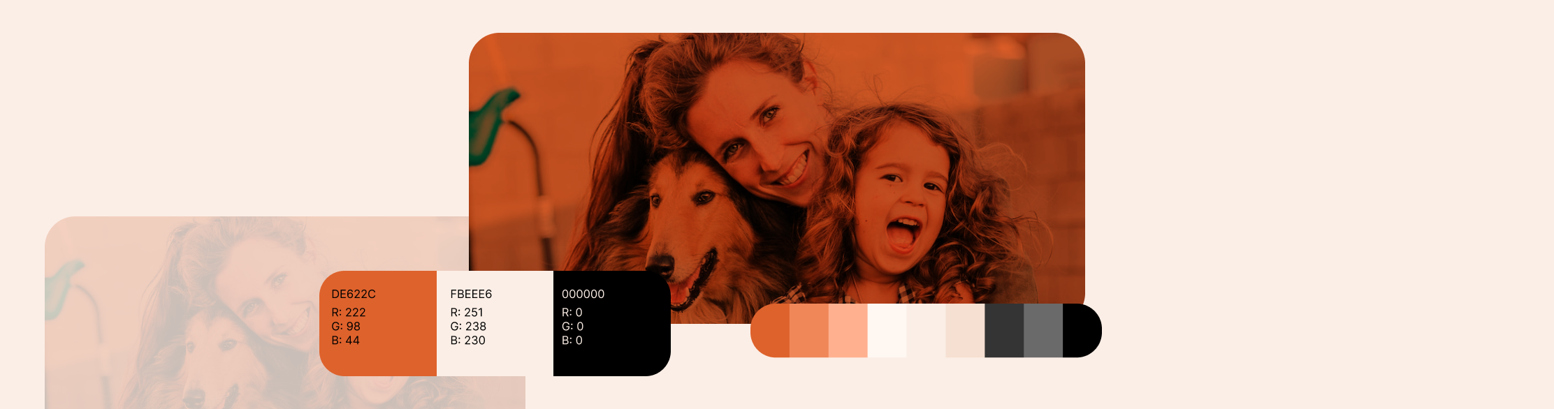
Choosing brown and black as brand colors was an incredibly thoughtful and meaningful decision for Maya. We wanted our brand to be a true reflection of our customers.Firstly, brown exudes a sense of warmth and reliability. As a color that resonates with the earthiness of the animal world. Just like the feeling of a well-worn leather collar or a cozy pet bed, brown speaks to the security and care we offer to pets and their humans. We understand that pets are not just animals; they are cherished members of the family. Brown embodies the reliability and reliability that our agency is built on, reassuring our clients that we're there to protect their pets with open arms.
Black, on the other hand, conveys a sense of sophistication and timelessness. It speaks to the seriousness with which we approach our responsibility of safeguarding pets' health and well-being. Just as a sleek, black pet carrier or a well-groomed black-coated pet stands out, our agency stands out in the world of pet insurance by being classic and elegant. We believe in providing quality pet insurance that stands the test of time.
These colors also resonate deeply with our audience - pet owners. They signify strength, trustworthiness, and a grounded connection to the pet world. Our agency is here for the long haul, a constant companion in a pet owner's journey, always ready to provide support when it's needed the most.
The harmonious contrast between brown and black allows our brand to be visually appealing without overshadowing the heartfelt connection we aim to establish with our clients. It's about showing our dedication to safeguarding their pets in a visually striking yet understated manner.
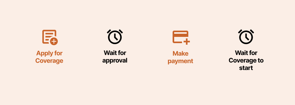
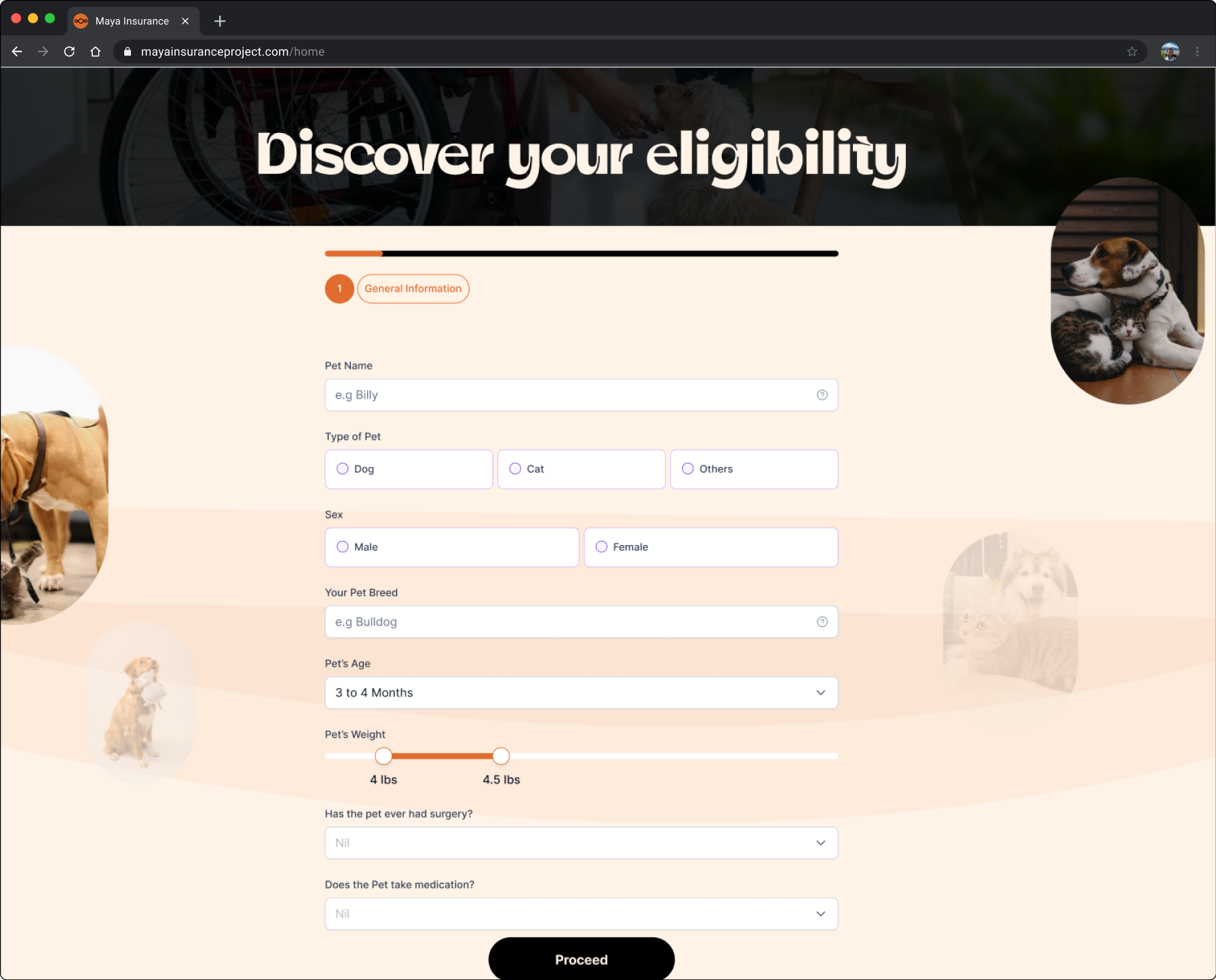
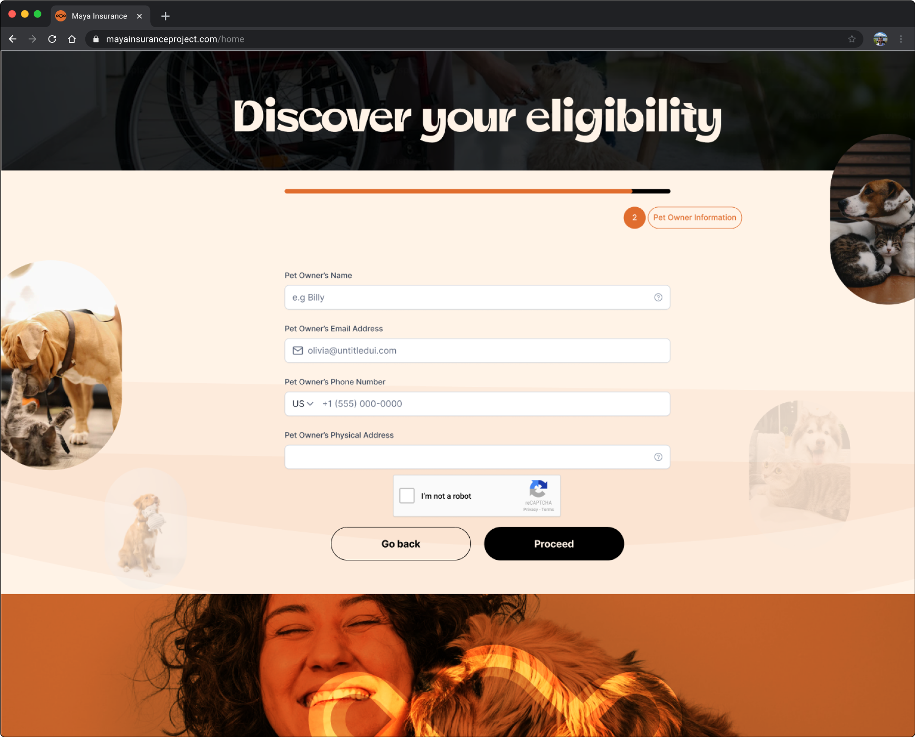
The main challenge we had with maya was figuring out the best and easiest way to onboard our customers, we had to understand how first time users may get started. and thus our customer journey was key to understanding this phase.Traditionally, first time users are onboarded by word of mouth from their vet doctors, campaigns and ads through social media

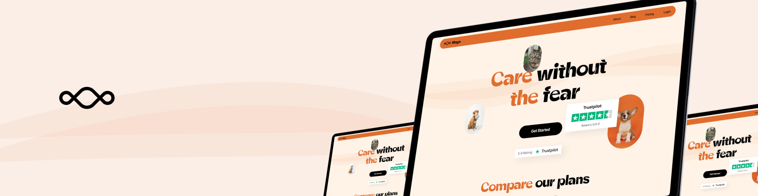
First I designed the landing page ushering in new users
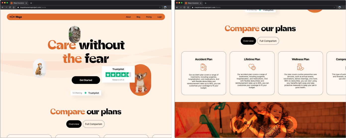
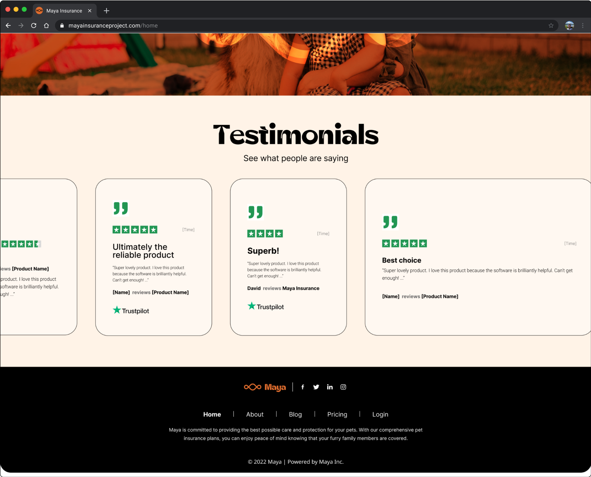
The pet insurance website used testimonials to help site visitors trust them more. They shared real stories from a variety of happy pet owners, making their brand feel more relatable and showing that they were a trusted choice.
These testimonials didn't just talk about the good experiences; they also showed how their insurance had made a big difference in pets' lives, often with pictures and real names to make it all seem more real and honest. By regularly updating these stories, they demonstrated that good experiences were a common thing, making people feel even more confident in their dedication to pets' well-being.