ReactSquad
Redefining Developer Outsourcing with a Scalable, Client-Centric Web Solution

ReactSquad.io is a developer outsourcing agency connecting top-tier developer teams with companies in need of reliable tech solutions. Designed and developed as part of the DailyDesign team at EarlyNode, I collaborated with Florian to craft a world-class web presence. My role encompassed creating the visual identity and branding, designing an intuitive user interface, and developing the website using Webflow. This project seamlessly integrated strategic design thinking with technical implementation, resulting in a platform tailored for scalability and user engagement.
Role
Brand, UI, Webflow
Industry
Technology Services
Date Published
Dec 2024
According to the client, The existing website faced two major challenges: their existing website was too generic and lacked a distinctive identity, making it difficult to stand out in a competitive market alongside giants like Lemon.io and Toptal.
Additionally, the site’s user experience failed to drive meaningful conversions, limiting its ability to effectively engage prospective clients. To address these issues, ReactSquad.io required a bold and memorable visual web presence that not only elevated their brand but also strategically optimized for lead generation and client acquisition.
Additionally, the site’s user experience failed to drive meaningful conversions, limiting its ability to effectively engage prospective clients. To address these issues, ReactSquad.io required a bold and memorable visual web presence that not only elevated their brand but also strategically optimized for lead generation and client acquisition.
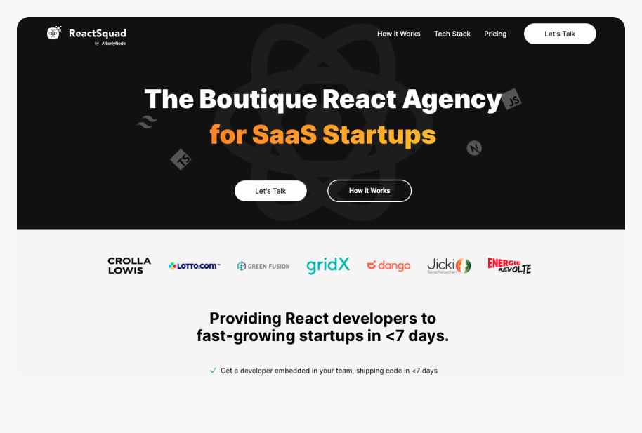

To address the challenges ReactSquad.io faced, we began by redefining the brand identity. This process involved extensive brand explorations, where we brainstormed and iterated on creative directions that could break away from the “vanilla” norms of the industry. To ensure alignment with the market, we gathered feedback from existing customers and potential clients, focusing on their perceptions and expectations.
Recognizing the need for distinctiveness, we conducted a competitor analysis, drawing inspiration from standout brands like Lemon.io that had successfully carved a unique niche. This analysis provided valuable insights into balancing creativity with functionality while maintaining the professionalism expected in a developer outsourcing agency.
Recognizing the need for distinctiveness, we conducted a competitor analysis, drawing inspiration from standout brands like Lemon.io that had successfully carved a unique niche. This analysis provided valuable insights into balancing creativity with functionality while maintaining the professionalism expected in a developer outsourcing agency.
Identity and Branding
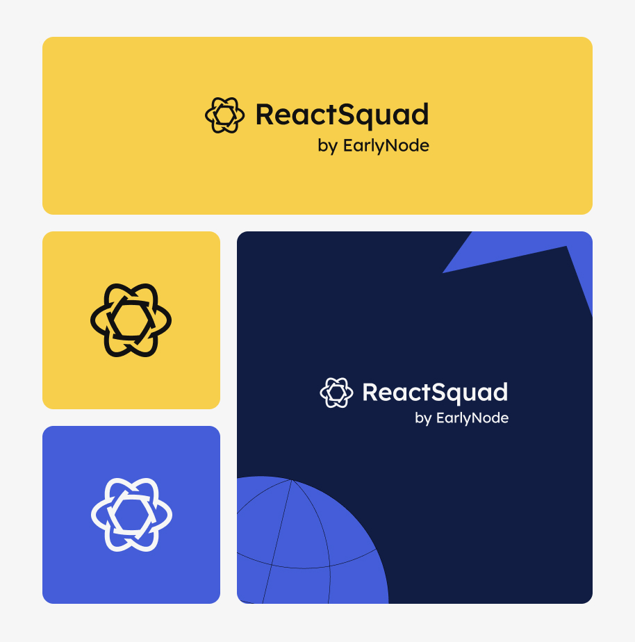
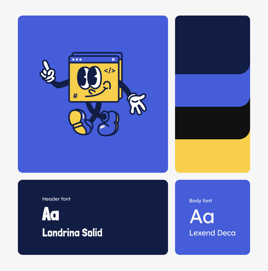
To translate these insights into a compelling visual identity, we adopted a vibrant and approachable color palette of blue and yellow.
Blue was chosen for its association with trust, reliability, and professionalism qualities that align seamlessly with ReactSquad.io’s core promise of dependable developer outsourcing.
Yellow introduced energy and creativity, symbolizing the innovative solutions the brand offers. Together, the combination created a harmonious balance between professionalism and approachability, ensuring the brand felt both credible and memorable.
Choosing brown and black as brand colors was an incredibly thoughtful and meaningful decision for Maya. We wanted our brand to be a true reflection of our customers.Firstly, brown exudes a sense of warmth and reliability. As a color that resonates with the earthiness of the animal world. Just like the feeling of a well-worn leather collar or a cozy pet bed, brown speaks to the security and care we offer to pets and their humans. We understand that pets are not just animals; they are cherished members of the family. Brown embodies the reliability and reliability that our agency is built on, reassuring our clients that we're there to protect their pets with open arms.
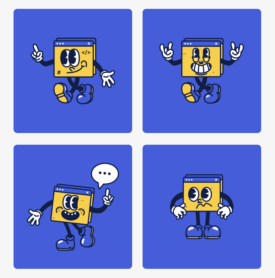
A key element of the rebranding was the introduction of a mascot: a cheerful browser window character. This playful yet relevant figure personified the brand’s mission of connecting companies with exceptional developer teams. It also served to break away from the overly corporate tone of competitors, injecting personality and warmth into the brand. The mascot not only reinforced ReactSquad.io’s focus on web and software solutions but also made the brand more relatable and approachable, resonating with both startup founders and enterprise clients.
This distinct identity laid the foundation for a website that would differentiate ReactSquad.io while addressing the core challenges of user engagement and conversion.
This distinct identity laid the foundation for a website that would differentiate ReactSquad.io while addressing the core challenges of user engagement and conversion.
Web Design
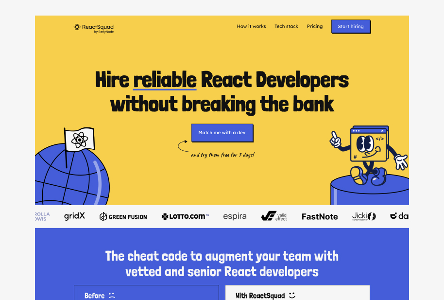
Building on the bold and distinctive brand identity, we extended the branding into the website design by exploring neo-brutalist elements. This design style, characterized by raw, minimal aesthetics and bold typography, aligned with the brand’s goal of standing out in a crowded market while maintaining functionality. The use of exaggerated grid layouts, sharp contrasts, and unconventional elements introduced a fresh, memorable user experience. These early design concepts focused on creating a visually striking platform that remained cohesive with the vibrant color palette and approachable tone established in the branding. Below are some of the initial versions we developed, each tailored to reflect ReactSquad.io’s unique personality while ensuring the design communicated professionalism and reliability.
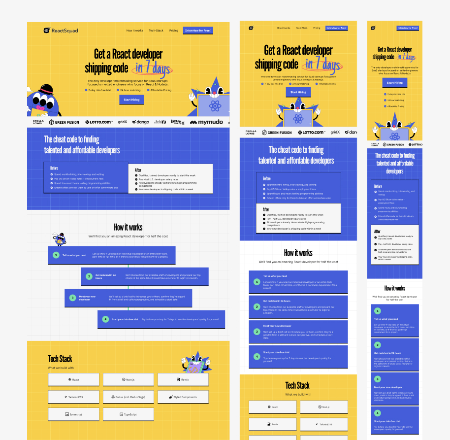
In the early stages of design, we experimented with the League Gothic typeface and a vintage sticker illustration style, aiming to create a unique and nostalgic aesthetic. While these choices reflected boldness and creativity, usability testing and feedback revealed challenges. The typeface posed readability issues, particularly in smaller text sizes, and the vintage sticker style didn’t fully align with the modern, vibrant direction we envisioned for the brand.
As a result, we transitioned to a more legible and contemporary typographic solution and updated the illustration style to reflect a cleaner, neo-brutalist influence. This shift ensured that the design remained visually engaging while enhancing usability and aligning cohesively with the evolving brand identity.
As a result, we transitioned to a more legible and contemporary typographic solution and updated the illustration style to reflect a cleaner, neo-brutalist influence. This shift ensured that the design remained visually engaging while enhancing usability and aligning cohesively with the evolving brand identity.
Development and Implementation
The ReactSquad.io website was structured to provide a seamless user experience while effectively showcasing the brand’s offerings. Key sections included a visually compelling homepage, a dedicated “About Us” page to communicate the brand’s unique value proposition, and a “Hire Developers” page optimized for conversions.
Additionally, in collaboration with the marketing team, we created nine SEO-optimized pages targeting specific development stacks, such as React, Next.js, Node.js, etc to enhance discoverability and cater to niche audiences.
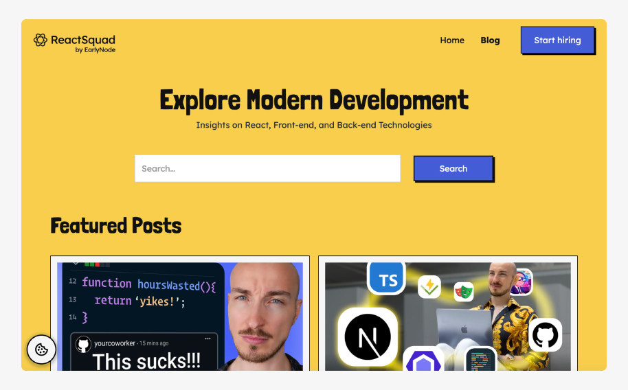
To further establish authority and drive organic traffic, we also built a blog site, designed to host informative articles and insights for potential clients.
A/B Testing for Booking Flow
To improve the booking experience and increase lead conversions, we conducted an A/B test with two distinct booking flow variants.
The first variant featured a direct calendar embed, allowing users to immediately schedule a call.
The second included a short form prior to the calendar, designed to capture leads who might not complete the entire scheduling process. The form served as an additional step to engage potential clients while gathering preliminary information.
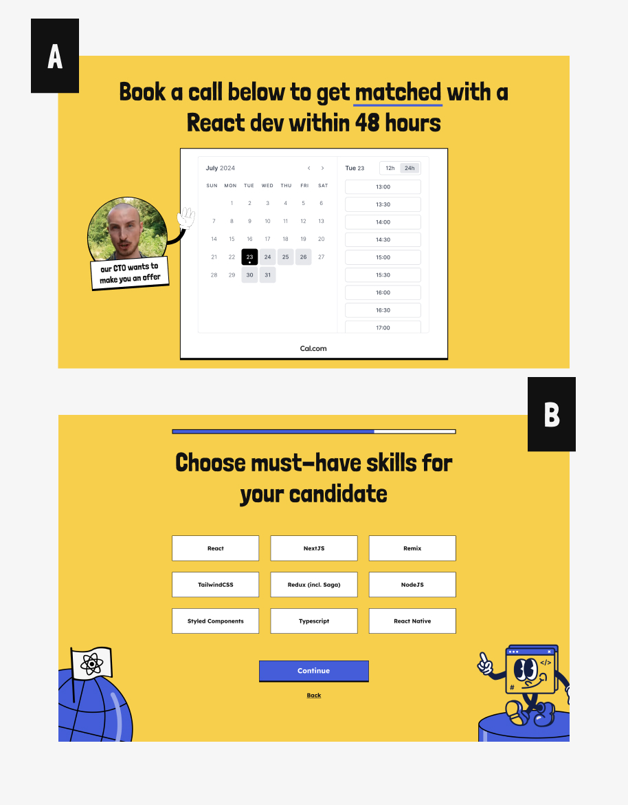
Using PostHog’s analytics tools, we tracked user behavior and measured success rates for both variants. The results revealed that the form-first approach outperformed the calendar-only flow, achieving a 70% higher success rate in lead capture.
This insight highlighted the importance of providing a flexible and intuitive experience for users, enabling us to implement the most effective design.
The collaboration between the engineering, marketing, and design teams ensured the test was executed seamlessly, and the data-driven outcome further aligned with the business’s goals.
Conclusion
The ReactSquad.io project was a testament to the power of thoughtful design and collaboration.
By addressing the brand’s challenges head-on—transforming a generic and underperforming platform into a bold, distinctive, and user-centric experience—we successfully elevated the brand’s identity and online presence.
Through a combination of creative strategy, innovative design, and technical precision, the new website not only stood out from competitors but also improved conversions and user engagement. This project showcased my ability to balance aesthetics and functionality, collaborate effectively across teams, and deliver impactful solutions that drive measurable business outcomes.

.gif)