Why spaces?
So while we weren't quite clear on the problem, what we were sure was that hunting for accommodation on campuses was a major pain point to all our friends and colleagues. and had been an issue we’ve always ranted about but never really looked at the why’s around it.
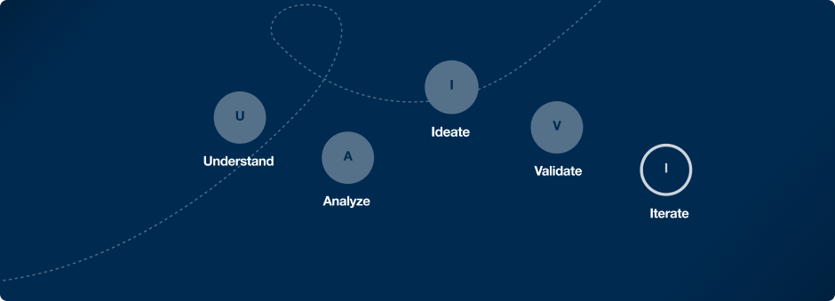
Understanding the Problem
Shoutout to Chiedozie for introducing the Lean UX Canvas to me. This became our starting point. and would be updated throughout the process
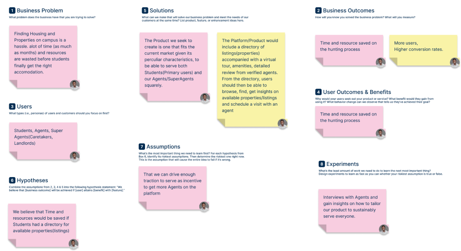
On completion of the Canvas we easily identified the key problems, our users, the assumptions we started off with, hypothesis and Solutions we were proposing. We knew that while we came up with these model, it was bound to change as we get more insights. At this point we decided to get some data from friends and colleagues to help validate our initial gatherings.
Next up we curated a range of questions and setup and online survey.
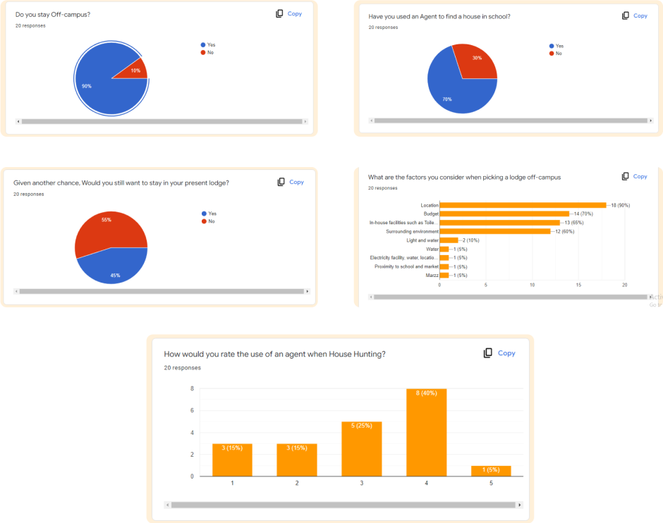
While we easily extracted good Quantitative data which was pretty great for validating most of our hypothesis. One thing that we couldn’t easily extract were the causes behind the responses. This was especially due to the nature of questions not being open ended.
So Sarah reached out to a couple of participants for further interviews. After speaking with 10 participants, we finally were able to make sense of some of the data gathered on the survey.
70% of students relied on agents
We discovered this was so due to large uncertainties involved in finding these accomodation. Amongst these uncertainties, the key reoccurring theme was Lack of Proper Information. This includes issues around:
- Not knowing where to find the accomodation
- Not having networks or being in the right social circles to access information on vacancies
- False information on properties
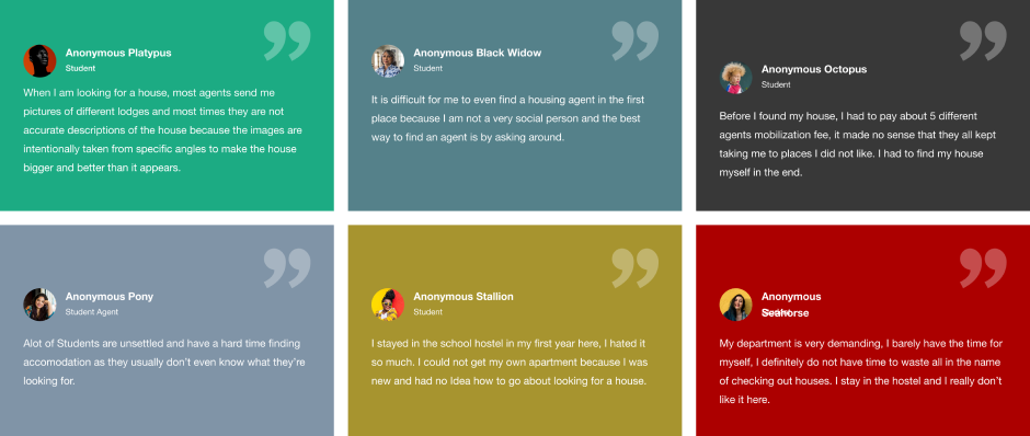
45% of students are “comfortable” with their current lodge
Initially this was surprising as we would have hypothesized otherwise. After the sessions we then got to understand why a significant amount of students would not move from their current lodges/apartments was credited to the hassle of getting the accomodation. They preferred staying to avoid embarking on the house hunting process as it was initially a hassle. Most participants affirmed that better deals with less hassle would change their mind
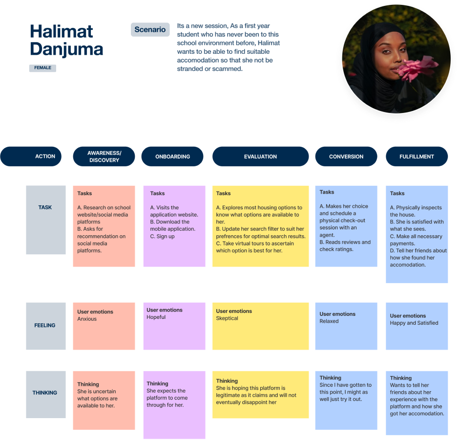
At this stage where we had a pretty solid understanding of our project and had begun some analysis.We moved on to create empathy with the data we already gathered by creating personas highlighting our quintessential users, their pain points, goals and scenarios.
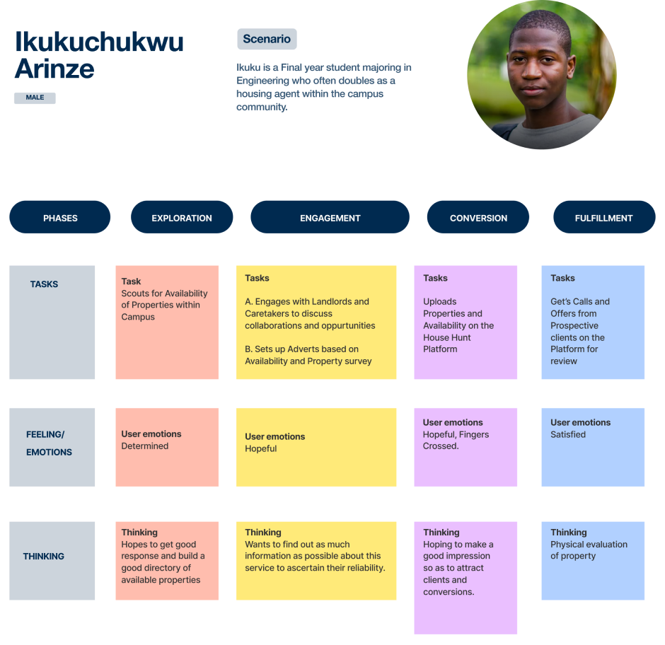
Based on the data gathered we understood that agents were a crucial part of the customer journey so we also did some persona capturing the typical agent, their pain points and goals.
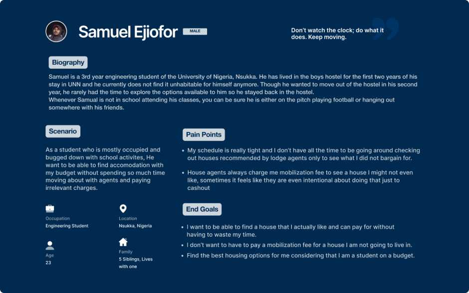
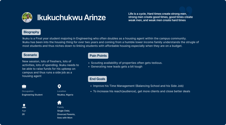
While the Personas helped in creating empathy with the primary users; Students, understanding the role of agents in the house hunting process was something we hadn’t fully grasped. So I reached out for more interviews with an agent and the major theme of the discourse centered around indecision of students in selecting accomodation as they’re usually faced with limited choices that may not check all their desired specifications.
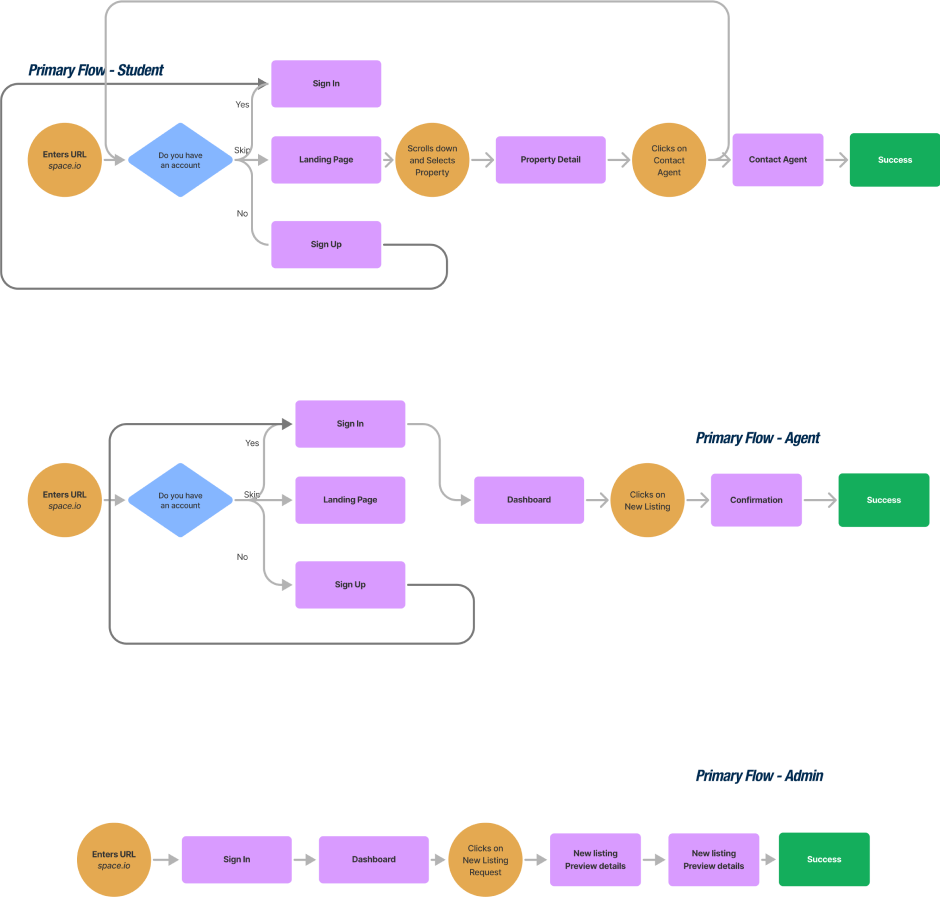
To better understand the relationship between agents and students in the house hunting process we created the journey maps from both points of view.
It was immediately clear that what we were building would essentially bridge the relationship between students and agents, offering the students a catalogue of properties to easily browse through compare and make decisions while the agents taking over from there and become responsible for updating the catalogue and a final admin user to regulate approval of new properties within the catalogue.
Competitor Analysis
At this point we had to understand the market, current offerings and what made them not so successful in order to know what we could focus on to improve our experience for our users. So we did a brief analysis of existing solutions
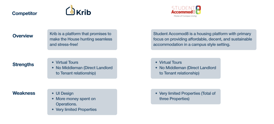
After the brief Competitor analysis, we quickly noticed that our proposed solution was a pretty daring one. We quickly realized was how existing platforms took the role and responsibilities of Agents due to the complexities in managing the category.
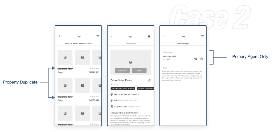
Given that we planned on including the Agents, the very first issue we encountered which is very typical in the Nigerian housing sector was a case wherein a single property is marketed by multiple agents.We had to really consider how to manage that.
At first we considered a system to eliminate multiple entries by aggregating such entries into a single property having multiple agent with the initial/first agent given higher priority.
We also considered having multiple entries of same property by different agents
Immediately after proposing this, we went on for further interviews with a couple of agents. At this stage our questions were more specific but also creatively curated to be open ended.
On analyzing our responses, our findings showed that most agents completely disliked the idea of other agents being on a property they posted.A few suggested some incentive such as a commission be given to the Primary agent.
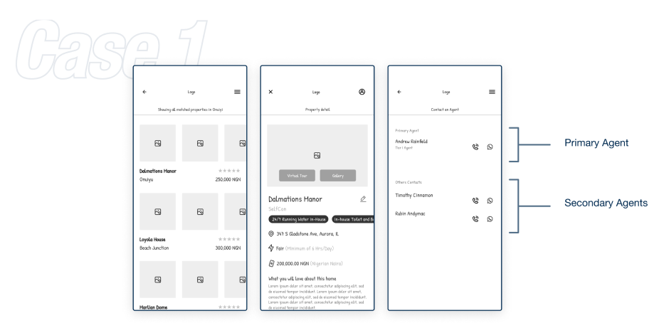
It was a choice between Case 1 a nifty little feature wherein a property/vacancy is only listed once and Case 2 having a complete directory of all agents listing as seperate listing.
Regardless of the attitudinal responses gotten from the interviews, we certainly are not oblivious😅 to the fact that behavioural response is key to a successful research and hope to get clarity during Usability Testing. So we decided to start off with Case 2
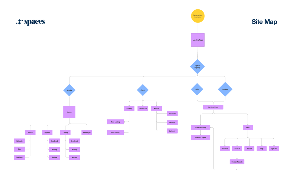
Architecture
Insights from the journey maps were key to guiding our decisions in skeching our our user flows and Site map
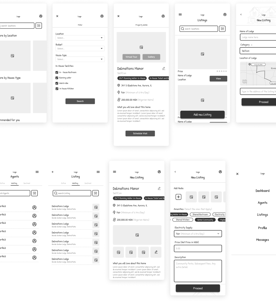
Lo-Fi Wireframes
We proceeded to create wireframes to give a skeletal form to all the ideas and functionalities of the platform, it also helped us better understand how the differents components of the application would interact and where we needed to make necessary adjustments before adding visuals.
One of the tools that made this very easy for us was the Paper Wireframe Kit by METHOD
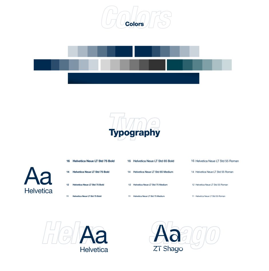
Style Guide
While we didn't utilize any of the existing design systems or created ours, we did create a basic style guide to aid uniformity across the platform as it was a collaborative project.
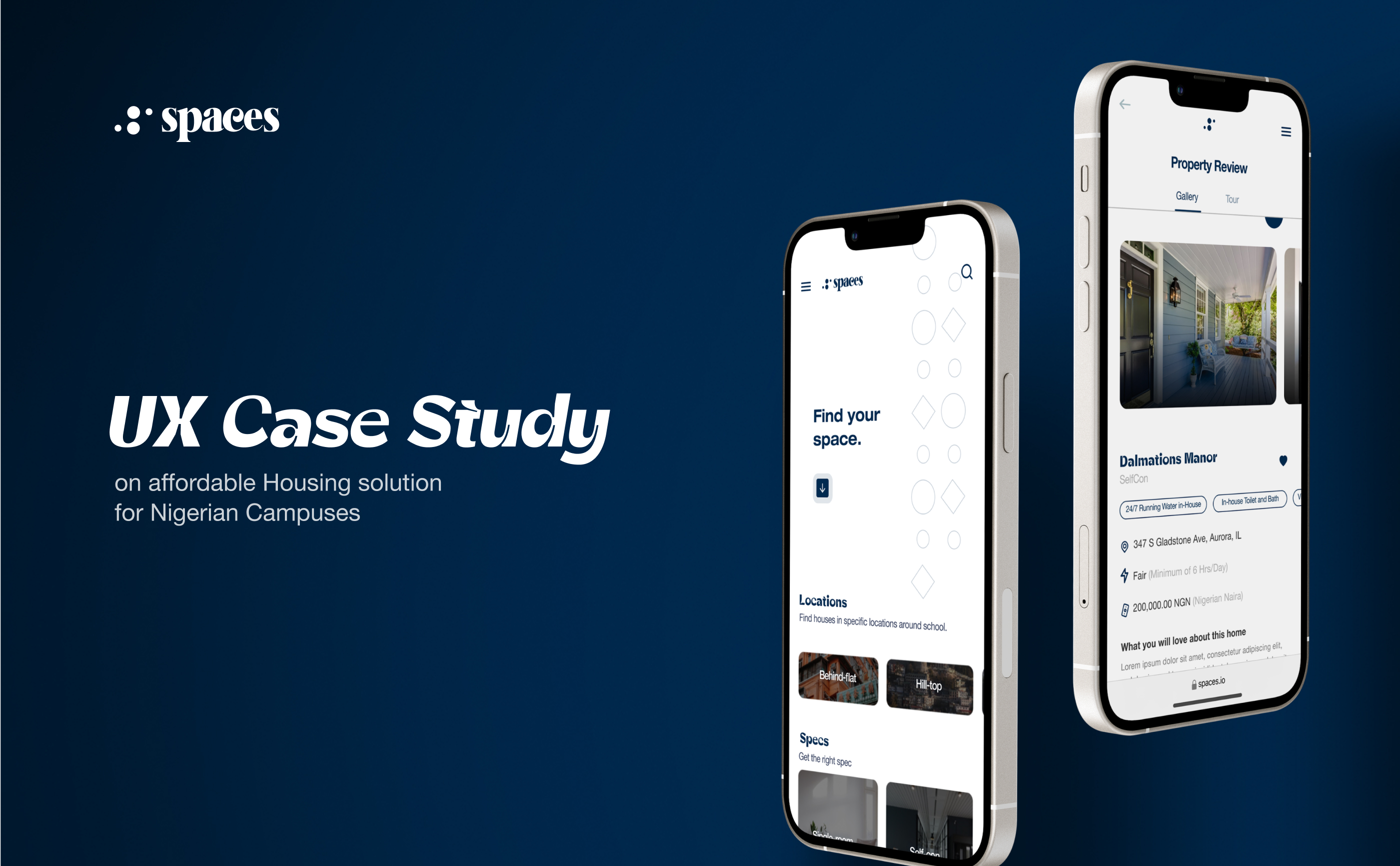
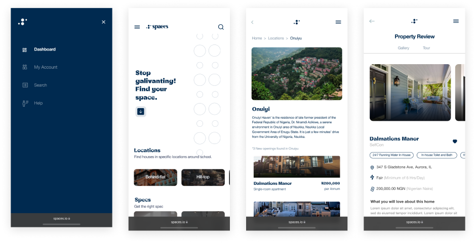
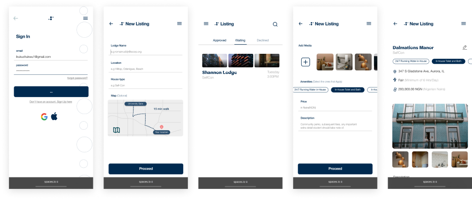
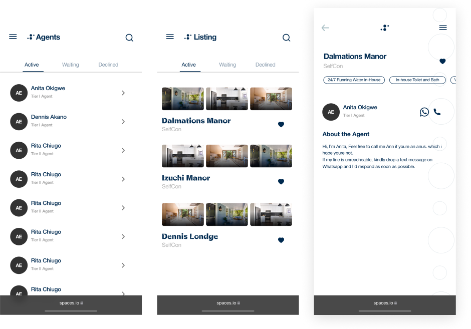
High-Fidelity Mockups
Takeaways
This was a collaborative UI/UX project and one of the most important things we learned from this project was the art of effective communication between each other as designers working together. A part of this was being able to communicate the reasons why we made certain design decisions. At times when we had conflict of what was considered the best design decision to take, what helped us resolve those decision conflict was the ability to communicate clearly why a certain choice was better off than the other with our target audience/users in mind.
Throughout the course of the project, we got to understand that indeed design is an iterative process as it is never exactly perfect, there is always room for improvement. At some point, we were carried away with the idea of putting out a perfect solution once and for all, but we did the best we could given the information we had from users at the time and also considering that time management is also an important skill in design, we had to move forward in our design process.
Documenting our findings, observations and decisions during the design process, helped us while writing this project case study documentation, we had documents to read through and revise, some of them on notion, notepads and even on paper.